Taking timesheets for 600,000+ TCS employees from desktop-only to a one-minute mobile habit
- Company
- Tata Consultancy Services
- Platform
- Mobile · iOS & Android (Ionic)
- Timeline
- 6 months, 2 releases
- Role
- UX designer & researcher
The problem
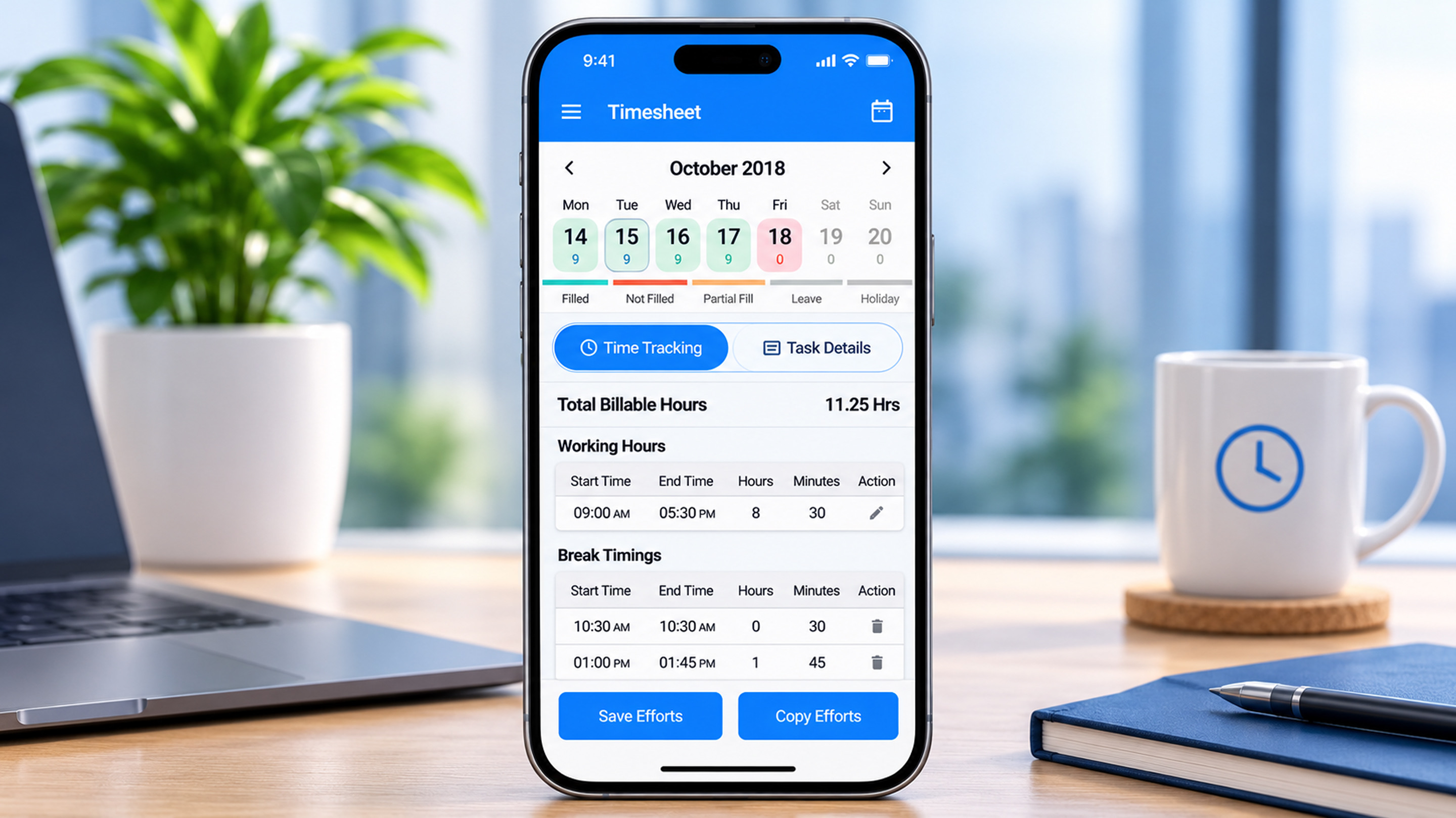
Every TCS employee must log their hours before month-end to get paid. The timesheet lived in a dense web app built for desktops, so people working on client sites or travelling batched entries at the last minute. Late and corrected submissions created payroll rework. Overseas employees, who bill hourly and log breaks and overtime, had a separate and even heavier flow.
My role
UX designer and researcher. Owned research, flows, prototyping, usability testing and the visual design for both releases.
Team
Product owner, Ultimatix platform team and an Ionic development squad of 5.
Scope
Release 1: regular timesheet for India. Release 2: overtime timesheet for overseas employees.
Design approach grounded in my Interaction Design training at the National Institute of Design (NID).
What moved
What changed for users
Before
- Web-only timesheet with a full-month grid
- All 7 charge types shown on every task
- Copying effort meant re-entering it day by day
- Overtime users mixed breaks and billable time by hand
After
- Week view by default, expanding to month on demand
- The 1–2 charge types people actually use come first
- Copy a day's effort to a day, week or month with a preview
- Break logging with automatic billable vs working hours
The calls that shaped it
Defaulted to what 70% of people do
Usage data showed about 70% of employees use one or two charge types and most work on assigned tasks. Assigned tasks became the landing tab and rare charge types moved behind a single tap.
Copy with a preview
Recorded Webex sessions showed people filling identical days over and over. Copy-effort lets them repeat a day across a week or month, and a calendar preview shows exactly which days will change before they confirm.
Week first, month on demand
A full-month grid doesn't fit a 360 px screen. The week strip shows status at a glance and expands into a month view through a single handle.
One framework, two audiences
Release 2 reused release 1's components and added a hub-and-spoke model for overtime: billing type, breaks and on-call each open their own sub-page. Reuse cut release 2's design time by about 40%.
What I took away
At this scale the best features were the ones that removed decisions. Most of the time savings came from good defaults rather than new functionality.Chayananda Nagesh · UX designer & researcher
Let's build something people finish using.
I'm looking for senior and lead product design roles on complex enterprise and AI products. Based in Bengaluru, open to hybrid and remote.
nchayananda@gmail.com
Write to me